Monday, 31 October 2016

Conceptual art


Conceptual Art
Conceptual artwork is the movement that prefers ideas over the finished products. Conceptual arts uses mostly words in an expressive way to create imagery, as well as objects and everyday objects as a canvas. E.g Mary Kelly uses dirty nappies from her new-born child as a canvas for one of her works.
Conceptual art requires the viewer to think and analyse the works to figure out the deeper meaning to them. It also confuses the reason when given a name that is usually irrelevant to the object used. Because of this, the idea much be original and not familiar from any other piece, with a meaning to the piece when the viewer digs deeper. 
Conceptual art began in the early 20th century by Marcel Duchamp. He began using different types of objects in his work. For example, a wheel, a stool and even a urinal which he titled ‘fountain’ and became one of his most known works in 1917. Piero Manzoni was another popular artist at the time, blowing up a balloon and attaching it to a string and titling the work ‘artist’s breath’.
There’s different types of conceptual art. One of these types are called performance art. For example, Marina Abramovic was a performance artist whose most recognizable artworks were ‘Rhythm 0’, where she stood with 42 objects (including a bullet and gun) and allowed the audience to do whatever they liked to her. Others have used words to create an impact on those around them. For example, Robert Montgomery, who used the quote ‘the people you love become ghosts inside of you and like this you keep them alive.’
Image result for rob montgomeryImage result for bruce mclean


Some just use regular objects or minimalist pieces of work that creates a meaning with the odd and meaningful titles. Finally, there are people who use themselves as a piece of art and take photographs. For example, Bruce McLean used himself as a self-portrait in some of his notable work like plinth.

Tuesday, 18 October 2016

Monoprinting technique

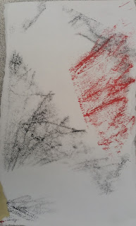
Yesterday I used a new technique called monoprinting. I used old mark making pieces of work and developed them into a monoprint piece of work.


First I recreated a shell pattern I made with pencil and created different textures by using different sides of the pencil. Then I flipped it and remade the work with a different colour. I used a yellow piece of paper as my surface.


Next I used cartridge paper and created soft textures with black and red ink and blocked some ink using a piece of paper in between the ink and surface. I used again my shell piece.


This time I used harsh lines to create a block like ink pattern and blocked ink using a square piece of paper. I used a map as a surface.

Finally I referenced another mark making piece I created and drew this with a stick, making it impossible for me to see what I had already done and created this. Then I used a little bid of red ink around. I used yellow paper for this.

I like this technique because it is something different and you can come up with very interesting results. However I feel I may not use this technique much in my future work.

Extended arm technique

I experimented with the extended arm technique last week and created more free hand effects with it on a large piece of paper.

My subject matter was an old piece of dried corn. I chose this because it has a bumpy texture and it has an interesting shape for me to experiment and draw with.


First I experimented with a piece of newspaper and black and white acrylic. I chose a section of the corns shape and used different techniques with the brush to make different textures. For example I dabbed the brush and used the end of the brush to create tone.

Next I used a much bigger piece of brown paper with an emulsion layer to create another final piece. Here I experimented in a much more free-handed way and did much quicker strokes of the brush. I also did different sizes of lines to have bold and thin lines. I also used less smooth shading and more textured shading like dabbing and using the end of the brush to smudge existing wet paint.
I feel like I could make this better by making it look less like the corn and layering more different techniques and textures onto the piece.


Final Piece (Visual Language)

I created an abstract final piece based on an emotion I chose to convey.

First I used a collage of brown paper onto an A3 piece of cartridge. Then I used a sponge to create a texture and tone with black white and grey. I used this to show sadness as these colours give a sad and serious emotion. Then I used scribbles with pen at the side to represent stress and then I used ink to drip down at the top and sides to resemble a cage. The cage then represents being trapped.
Next I added a few more pieces of brown paper to overlap some of the previous work I did in order to create more of a texture to layer onto.
Next I ripped up the A3 piece of paper and stick them together in a different order. This was to create a jumbled effect and represent feeling broken. I added oil pastel lines and blended it in to represent cracks to show more of the broken emotion.
Next I added more cracks and made them more bold and added a flat line in the middle. This line spikes up at the left, to represent a pulse.
Finally, I added ink drops to represent tears and darkness seeping down.


The piece as a whole has a lot going on to represent a jumbled, stressed emotion of the brain that a person has while going through these various emotions. I feel I did well with the composition, however there could be more tone in the artwork


Who Am I?

For this lesson we reflected more on the theme of "Who am I?" and drew visual language based on emotions I had during my happiest and worst moments in my life. Both my happiest and saddest moments happened recently and close together.

My happiest moment

My happiest moment in my life was around August this year. I felt carefree, excited, childish, entertained, ecstatic and stress free for 2 weeks. It was at the sea side, which in the day was joyful and fun and bustling with people. At night, it was a beautiful array of different coloured lights and pictures which glowed in the dark. The buildings had eye-catching and lovely lights to watch and you also had arcades to entertain yourself with.

My saddest moment

My worst time in my life was when I had to go through exams around July-August this year. Going through my exams I felt stressed, anxious, nauseous and nervous for trying to get the best grades I can. I had overworked, when I was in the dead silent hall I felt panic and my mind was in a jumble despite the silent atmosphere meant for concentration. I had doubts like I could not achieve anything and I was broken.


The sorts of things that make me happy are peace and quiet for drawing, achievements, compliments to my artwork, finishing tasks, music, watching my favourite YouTubers, and making someone else happy.
However, the things that make me unhappy are upset friends and family, doing nothing productive, stress and losing somebody.

For my first exercise, I drew 2 pieces of abstract art to represent both the happiest and saddest moments.

Happy:


For my happiest, I decided to use wallpaper as a textured background with oil pastel and graphite to capture the texture.  I tried to add various tones and shades of both black and white with lines going upwards to symbolise growth and accomplishment.

Sad:

 
For my saddest, I decided to use emulsion paint on brown paper because of the lined texture it gives when you use oil pastel, charcoal and graphite effectively. I used a monochrome tone to give the viewer a negative emotion based on the colours. I used a broken heart shaped object in the middle very faintly to represent the broken feeling, with the black oil pastel representing rain.

Afterwards, I redid my negative emotion to be a more free piece of artwork. It is much more abstract and you cannot tell what exactly it is by looking.

Finally, I used my artist Ian Liddle as well as the negative emotion to create this piece of artwork. My artist influenced me by the rough sketch like lines and the continuous like along with block colouring in the piece. I have used many different techniques in order to get this result. For example, I used thread to create a 3D effect in the work and added layering in several different areas to add more depth of tone in the piece. I also practiced a new technique with cello tape, which I find challenging but a unique way of layering drawings onto the piece to make it more eye-catching. Finally I used materials such as ink to drip down, graphite, thread, biro, oil pastel and charcoal. In order to improve, I can add further layers with cello tape and gloss paint on top of the flat black ink.